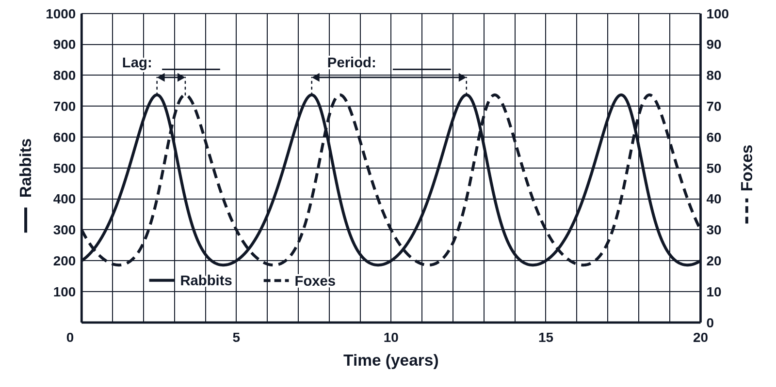
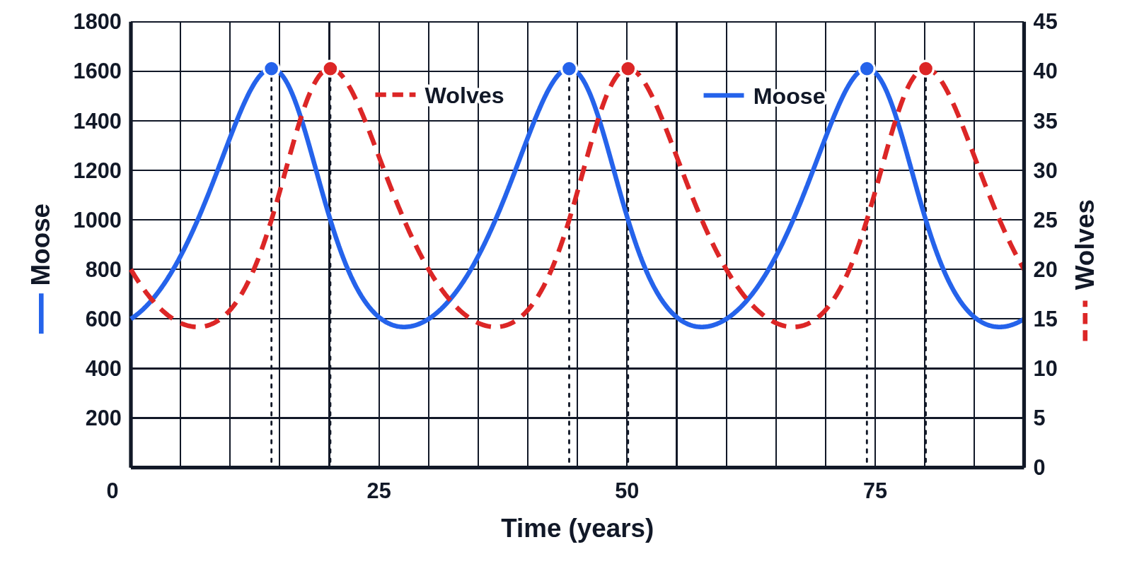
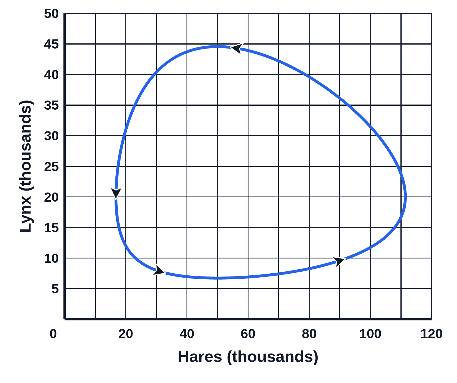
Hare and lynx census data graph

An example figure from the Predator–Prey Cycles generator.
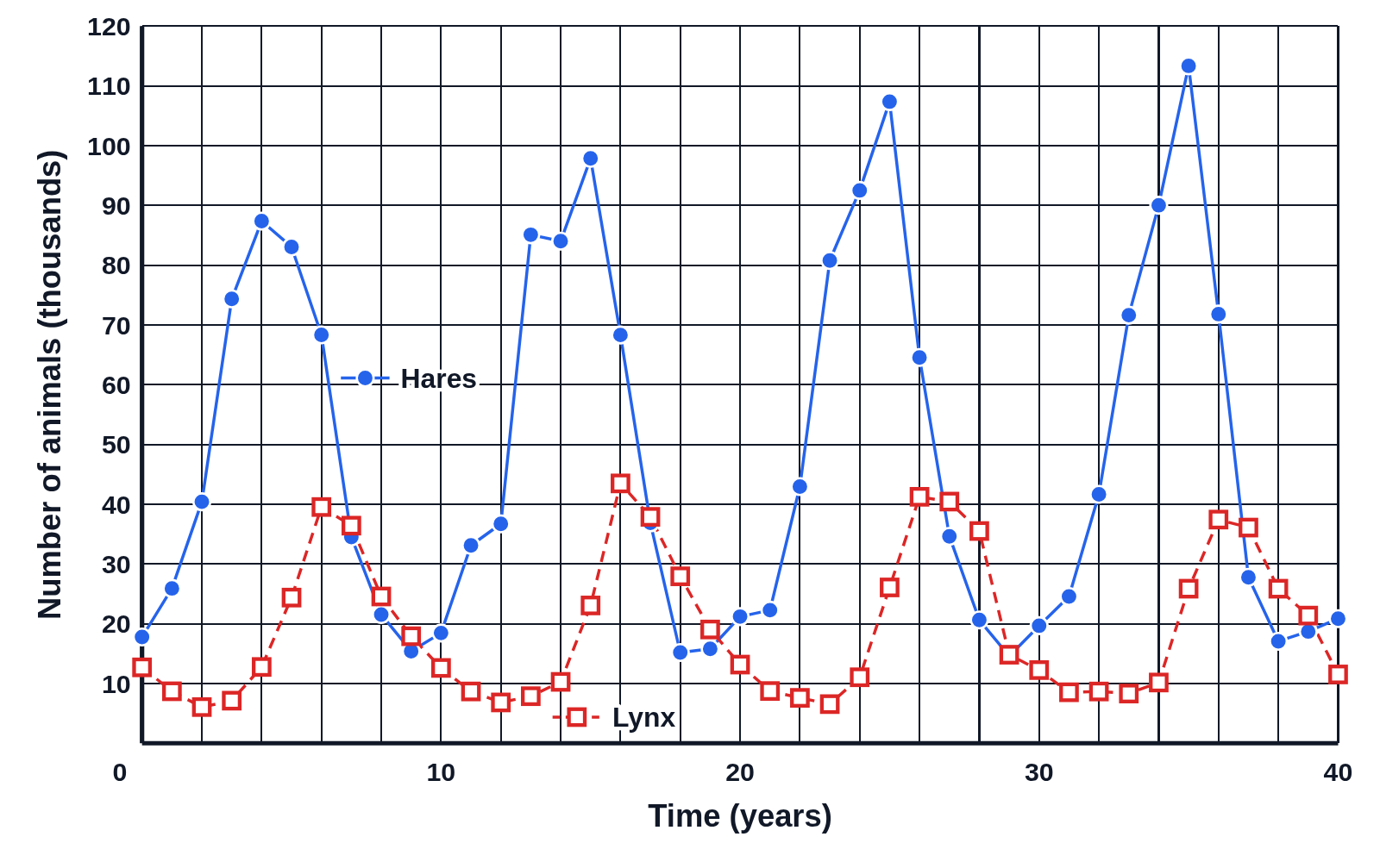
Graph of yearly census counts of hares (blue dots joined by a solid line) and lynx (red open squares joined by a dashed line), in thousands, over 40 years, rising and falling in four uneven cycles
Census counts of snowshoe hares (blue dots) and Canada lynx (red squares), in thousands, taken once a year for 40 years and joined by lines, solid for hares and dashed for lynx. Each count is off by about 10%, the way a real census is, so the peaks come out uneven, but the lynx still peak after the hares in every cycle.

Editing opens it in Predator–Prey Cycles with these settings, to change anything and copy or download your own.

Answer key

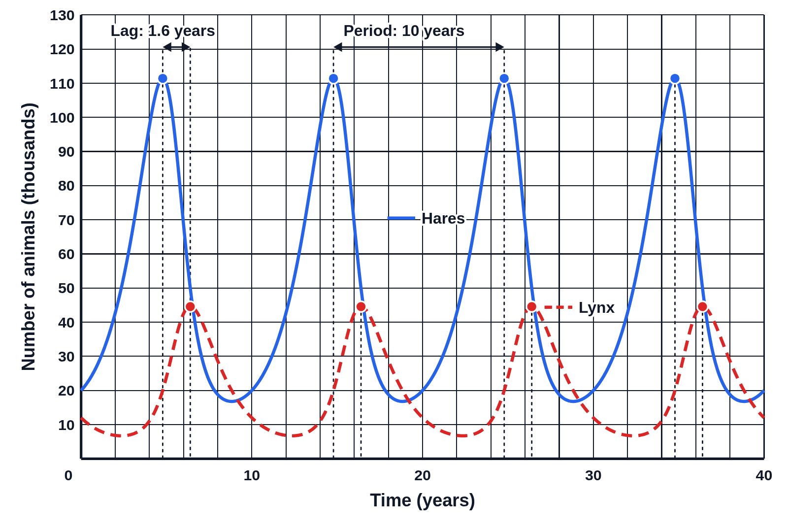
  • Period: a cycle every 10 years
  • Lag: the lynx peak 1.6 years after the hares

Free to use in your tests, worksheets, slides or anything else. Open source under Apache 2.0. How to reuse our figures
More Predator–Prey Cycles examples