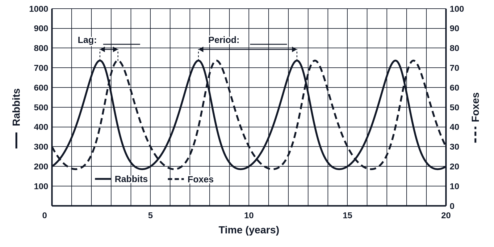
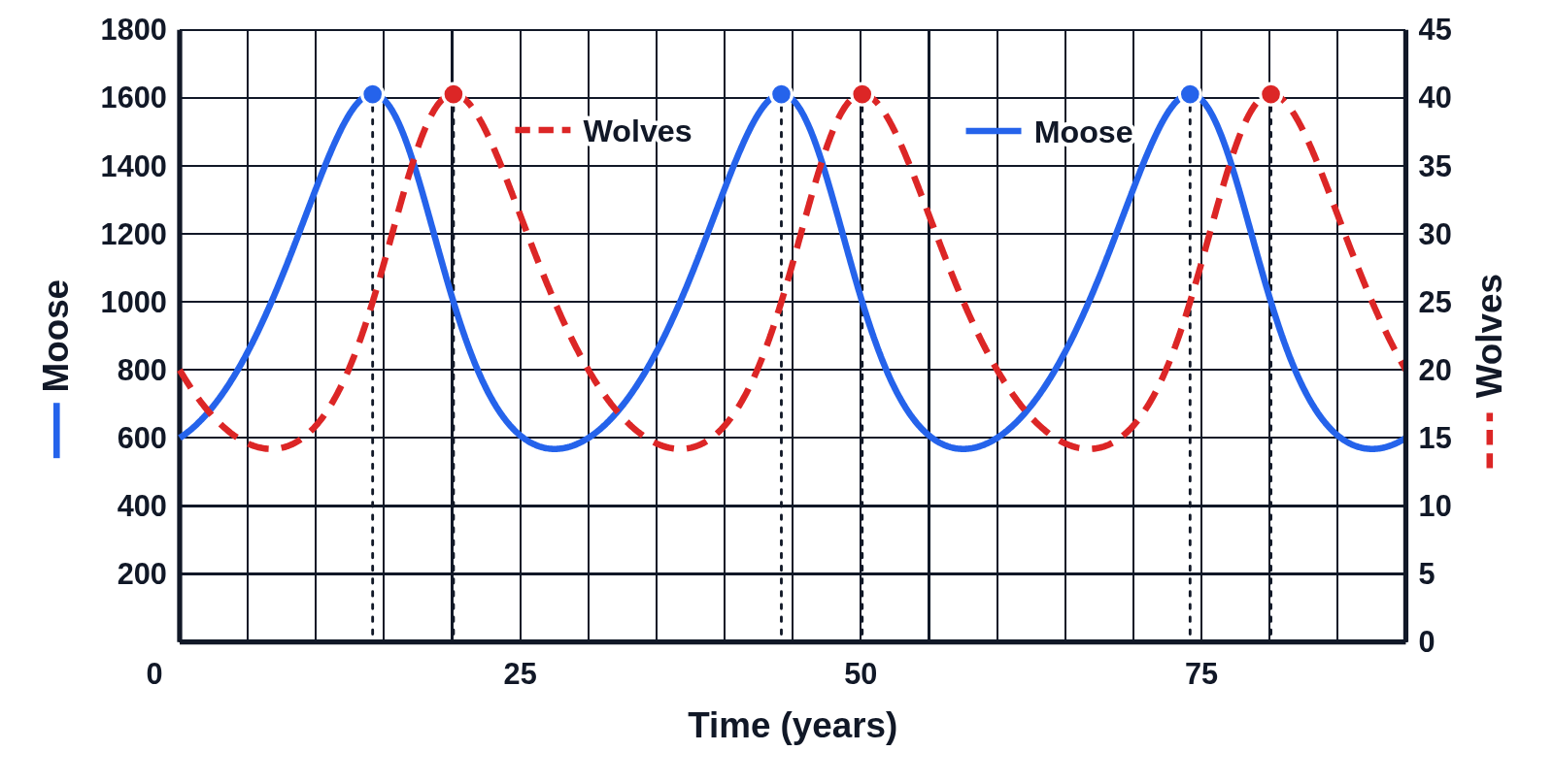
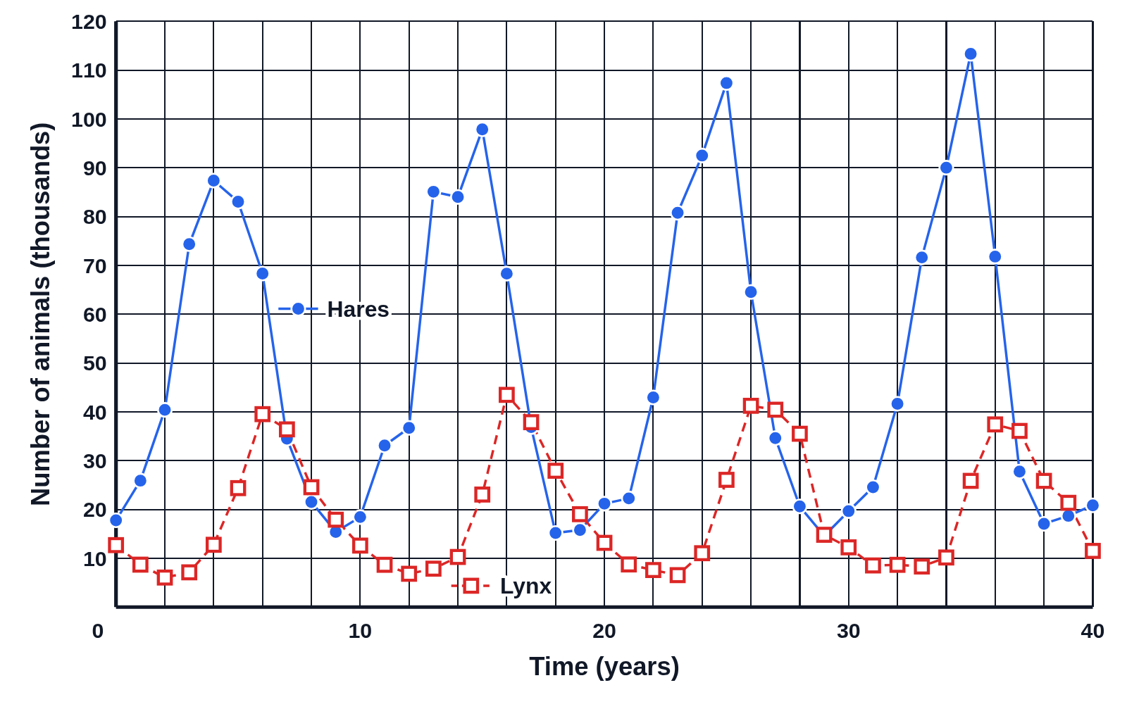
Snowshoe hare and lynx population graph with lag and period

An example figure from the Predator–Prey Cycles generator.
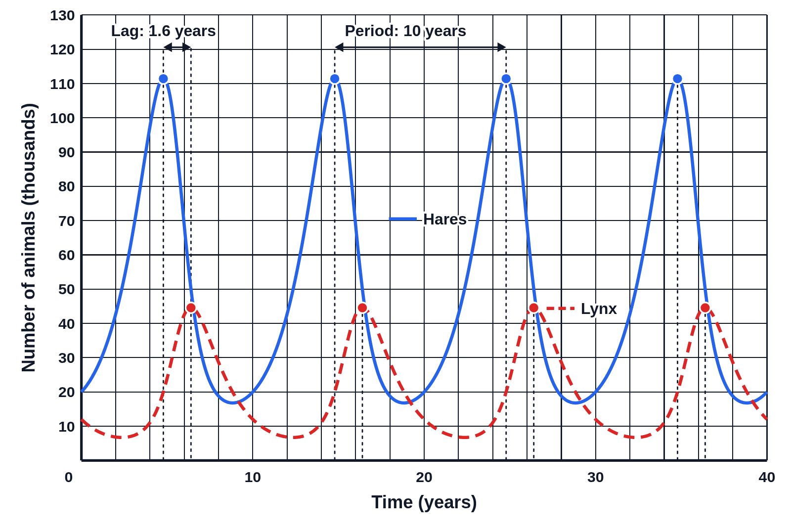
Graph of snowshoe hare and Canada lynx populations in thousands over 40 years, hares a solid blue line and lynx a dashed red line, each peak marked with a dot and a dotted line, with arrows labeled “Lag: 1.6 years” and “Period: 10 years”
Snowshoe hares (solid blue) and Canada lynx (dashed red), in thousands, over 40 years, from the Lotka–Volterra model. Both populations rise and fall in a repeating cycle, the lynx peaking a little after the hares. Each peak has a dot with a dotted line down to the time axis, and arrows mark the lag from a hare peak to the next lynx peak (1.6 years) and the period from one hare peak to the next (10 years).

Editing opens it in Predator–Prey Cycles with these settings, to change anything and copy or download your own.

Answer key

  • Period: a cycle every 10 years
  • Lag: the lynx peak 1.6 years after the hares
  • Hares (thousands): 16.8 to 111, averaging 50
  • Lynx (thousands): 6.72 to 44.6, averaging 20

Free to use in your tests, worksheets, slides or anything else. Open source under Apache 2.0. How to reuse our figures
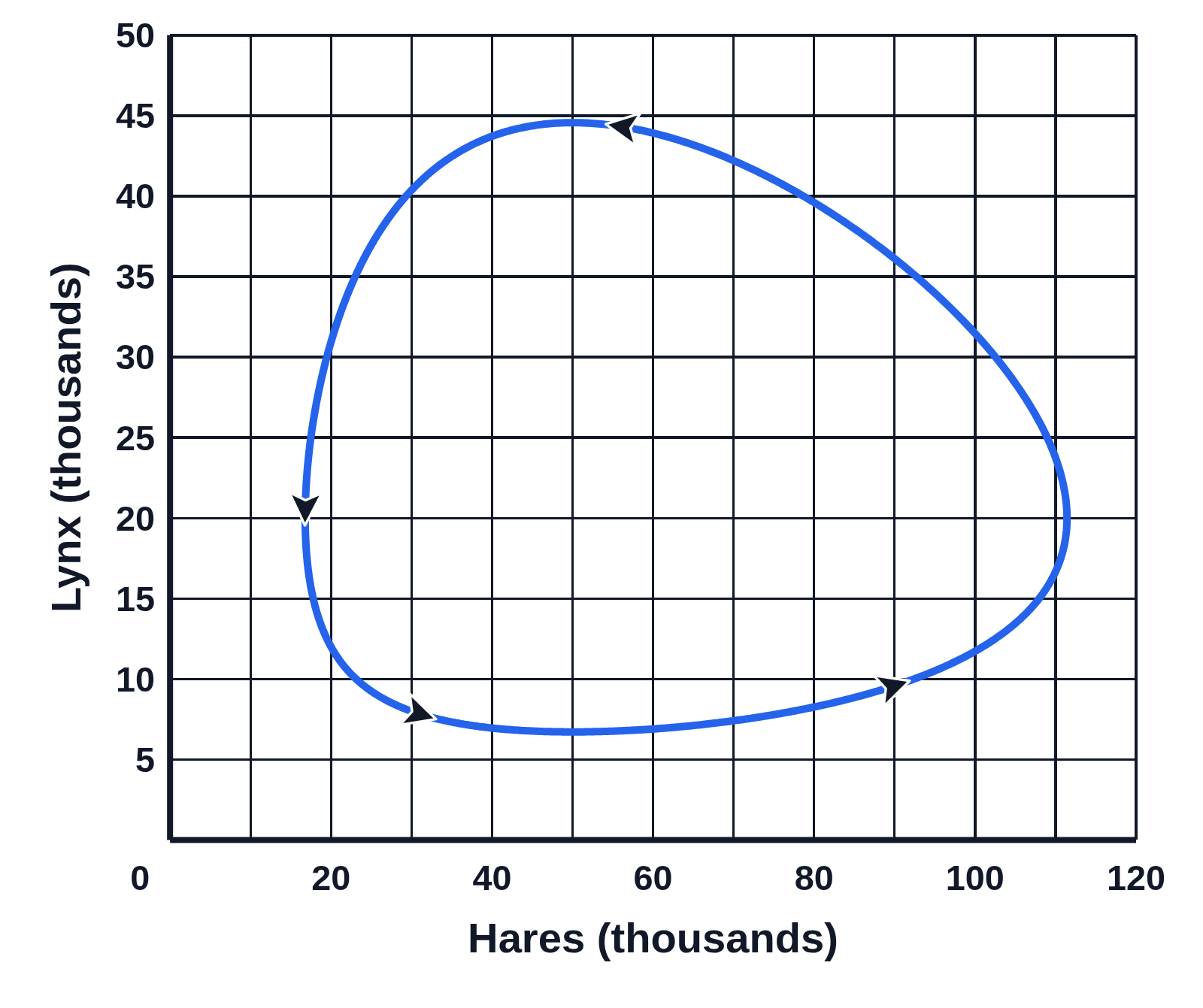
More Predator–Prey Cycles examples