Exponential vs. logistic growth graph (J-curve and S-curve)

An example figure from the Population Growth generator.

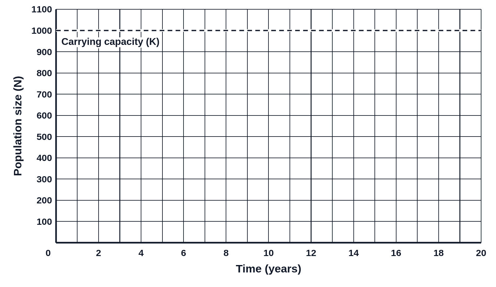
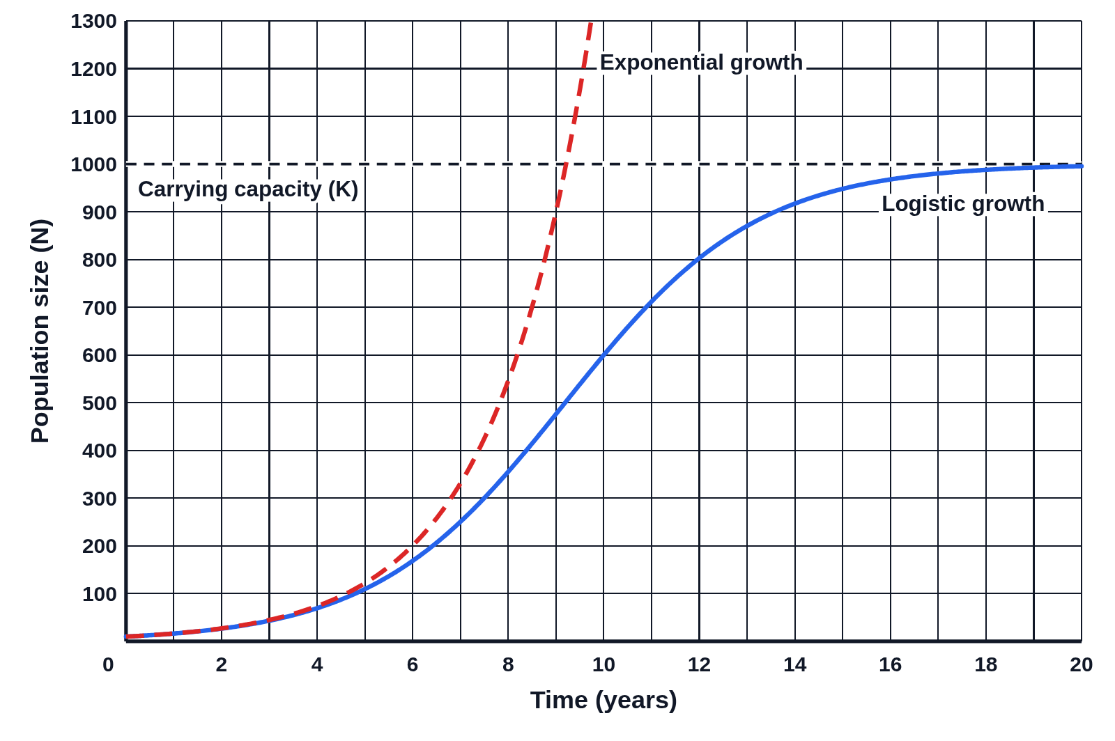
Graph of population size over 20 years with a dashed red J-shaped curve labeled Exponential growth running off the top and a blue S-shaped curve labeled Logistic growth leveling off at a dashed carrying capacity line at 1000
Exponential and logistic growth from the same starting population of 10 and the same r, 0.5 per year, graphed over 20 years. The two curves match at first; then the dashed exponential J-curve shoots off the top of the graph, while the logistic S-curve slows and levels off at the carrying capacity, 1000.

Editing opens it in Population Growth with these settings, to change anything and copy or download your own.

Free to use in your tests, worksheets, slides or anything else. Open source under Apache 2.0. How to reuse our figures

More Population Growth examples